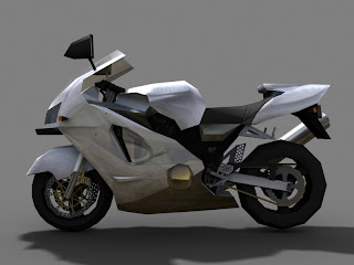

The bike was done for my class. Thanks for everyone who was kind and helped me with it last Sunday!
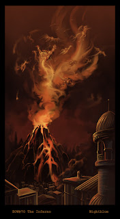
The drawing was for environment of the week on conceptart.org. I'll be seriously practicing perspective and lighting in the next few months.
We are a group of game and movie artists, professional creatives, and students from around the Dallas area that like to get together to sketch. Anyone that would like to join us to learn, chat, and of course, draw! are always welcome. We meet every Sunday from 11:30 to 3:00, at the Half Price Books on 5803 E Northwest Hwy Dallas, TX 75231 (214) 379-8000.
4 comments:
Whalp, won't be able to make it out this week either. Ack...
The motorcycle seems pretty good. My main critique on it is that rear tire. I wonder if you might be able to space some polys elsewhere so that you could round it out better? Those wheels are key shapes for that bikes silhouette.
For the painting. I feel like there are conflicts of interest happening. Since the foreground elements are so crisp (hard edges) and tightly rendered it competes with the much more interesting background which also has some of the same elements. Perspective issue aside, if you wanted to make the buildings the focal point of interest, they would probably need some more lavish embellishments and attention to details (lots of references to help push the believability.) The background is wonderful. I almost want that whole city burned to a crisp so my eyes only look at the power of that Demoncano!
Excellent work though! You've improved a lot since getting into Guildhall. I recall some of your work from the forums. Keep it up!
-Hofer
Doh! I should offer a suggestion in it's current state that would deal with that conflict of interest. My other comments would probably take to long at this point to implement.
I'd darken the value on the foreground city. This will reinforce to the viewer where exactly you would like most of our attention drawn to.
Hope ya don't mind, I did a small touch up on it so as to show what I mean. http://www.digijive.com/howdy/EOW70_pv2_touchup.jpg
Good luck!
-Hofer
Ah, you are right! pushing the buildings darker really does improve the focus of the painting. I feared that the entire painting might get too dark, but maybe I could brighten up the flames and the clouds/dust around it just a bit...
I did not realize how important the silhouette the tires of the motorcycle was until I took the model to the sketch group and received precious feedback. I added polys to the front but could not bear to take anything else down so the back remained as is. In hindsight that's such a noob thing to do, haha.
Thanks for the feedback!! Hope you make it next week.
For your environment, one method I've used to see if the values are working and if there's enough contrast...is to convert the image to grayscale (not just desaturating it), but going from RGB to Grayscale with the file.
I know some artists (myself included...on occasion) who will do the entire concept in grayscale first and then overlay color in Photoshop. Helps keep the image from going muddy from lack of contrast.
Hope that helps! And I'll see if I can find a link or two with examples.
Post a Comment